An Intro
The first club I joined as a first-year university student was The Cannon, which was the engineering newspaper at UofT. I heard from frosh leaders that the best way to meet new people was to join clubs. All the clubs at club fair looked intimidating; after all, how could I actually contribute to a solar car club as a first-year civil engineer. But I realized being a photographer at The Cannon was something easy I could do.
I didn’t end up take photos. The club was so short-staffed during my first year, that I ended up being assigned some graphics and layout work. Over time, I became very proficient at Photoshop, InDesign, and Illustrator, and ended up becoming the lead graphics/layout designer.
During my second year, our editor-in-chief at the time started to ask non-writers if they wanted to contribute articles. I always thought my writing ability was terrible (I absolutely hated high school English), but I loved talking about transportation. Eventually, I decided to write an article detailing Toronto’s 2040 transit plans and created a map of all projects that could be completed by 2040, styled as the current TTC subway map.
Over the next 3 years, I began to write more frequently, and write about topics outside my comfort zone of transportation. Writing became easier to me, and I began to like writing articles. Often, I’d pair my articles with a beautiful graphic made using Illustrator.
It’s been 2 years since I graduated from undergrad, and I realized that I miss writing articles. So when I decided I was going to create my own website, adding a blog just made too much sense. This blog is going to feature transportation topics, but it’s also going to feature some more personal topics. Some articles might be long and detailed, while others might be short and fun. In short, I plan to write about anything and everything.
History of the TTC
Now, since I can’t just leave this article at 300 words with no meaningful content, here’s this cool GIF I made. I was inspired by this map by Jake Berman, and wondered about how the TTC’s rail transit network evolved over time. So after hours of research from Wikipedia (including references listed on Wikipedia), Transit Toronto, and Steve Munro, I made this GIF. I recreated the TTC network ~70 different times using Illustrator, and then combined it to a GIF.
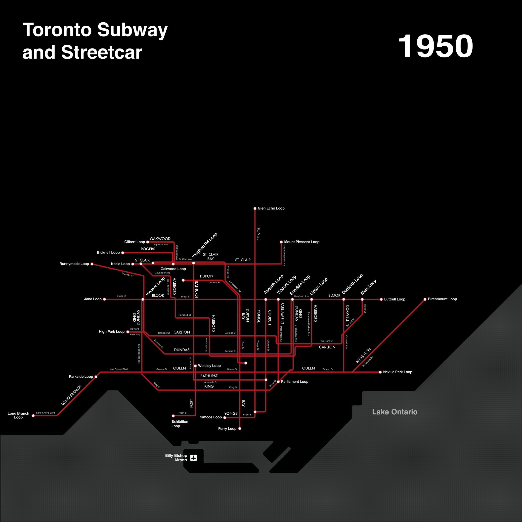
When I first came to Toronto, I saw this huge CLRV rumbling past me on College Street, and I couldn’t help but think that I’m truly in Toronto. While Toronto is unique that its one of the few cities that kept it’s legacy streetcar network, it’s a bit sad to see how much of the network was lost. It was interesting to learn the stories of how Steve Munro and other advocates fought to save most of the network, but the network lost other lines for no good reason (Mount Pleasant and Rogers Road come to mind).
Looking at this GIF has also shown how much transit expansion has stalled since the 1980s. Part of it has to do with the 1990s recession (some lines still do not have the same level of capacity as before the 1990s), while part of it has to do with politics. Obviously Transit City being cancelled and re-approved (but only for some LRT lines) was a big factor, but other political factors exist. The ridings that have been fundamental in deciding provincial elections lie in the 905 and North York, so it’s no surprise that GO Transit expansion, suburban highway widening, TYSSE, and the Shepard Subway were the biggest transportation expansion projects completed since the late 1990s. But the next 3 years will prove to be transformative for the TTC. The Crosstown LRT will contribute to the growth of Midtown as an alternative to downtown, while the Finch LRT will replace one of the busiest bus routes in North America and benefit many equity-seeking residents that live along the corridor.